Happy bee
2024

Package design for Honey Bee, a honey brand based in South Korea.
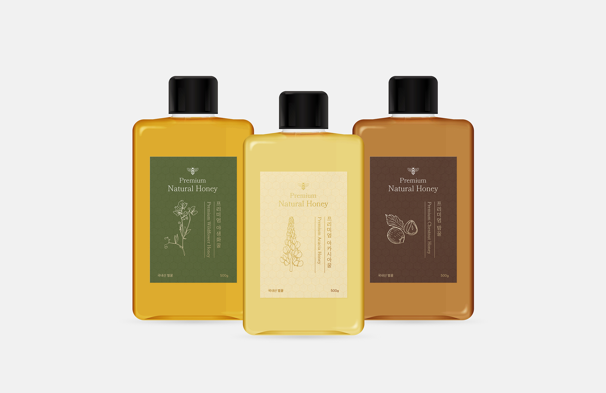
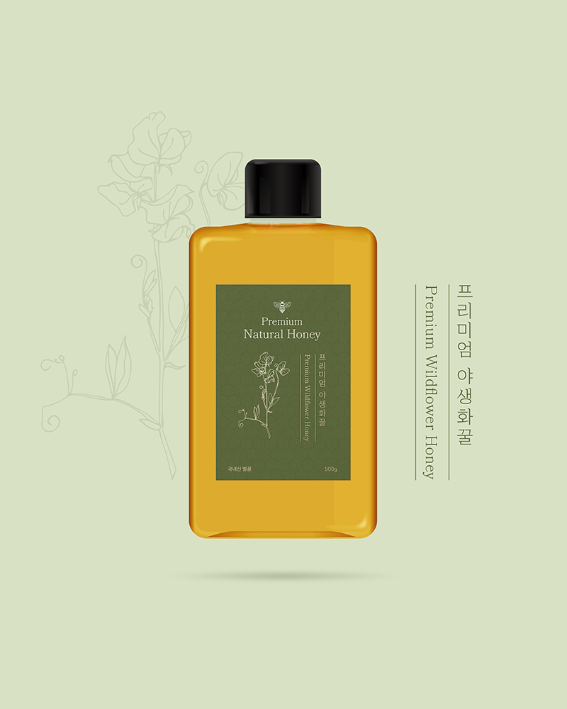
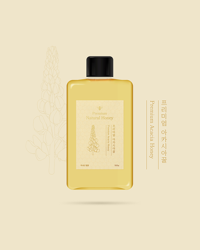
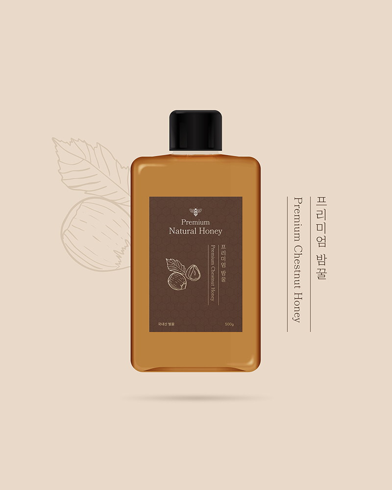
For Happy Bee’s honey packaging, I designed a premium line that celebrates the unique character of three distinct honey varieties while maintaining a cohesive visual identity. Each package uses a carefully selected low-saturation color palette that reflects its specific honey type: a calm green for wildflower honey representing natural vitality, a subtle beige for acacia honey suggesting pure taste, and a rich brown for chestnut honey conveying depth of flavor.
The design system elevates each package through gold leaf illustrations of the specific honey’s source plants, creating a luxurious visual narrative that connects product to origin. Refined Ming typography in both Korean and English anchors the design, balancing traditional craftsmanship with modern elegance. This approach transforms each honey package into a storytelling object that communicates the product’s premium quality, natural origins, and deep cultural connection to Korean honey-making traditions.
Credits
Designer : Eva Park
Illustration : Freepik
© 2024 Hyojeong Park


