Berry Pang
2024
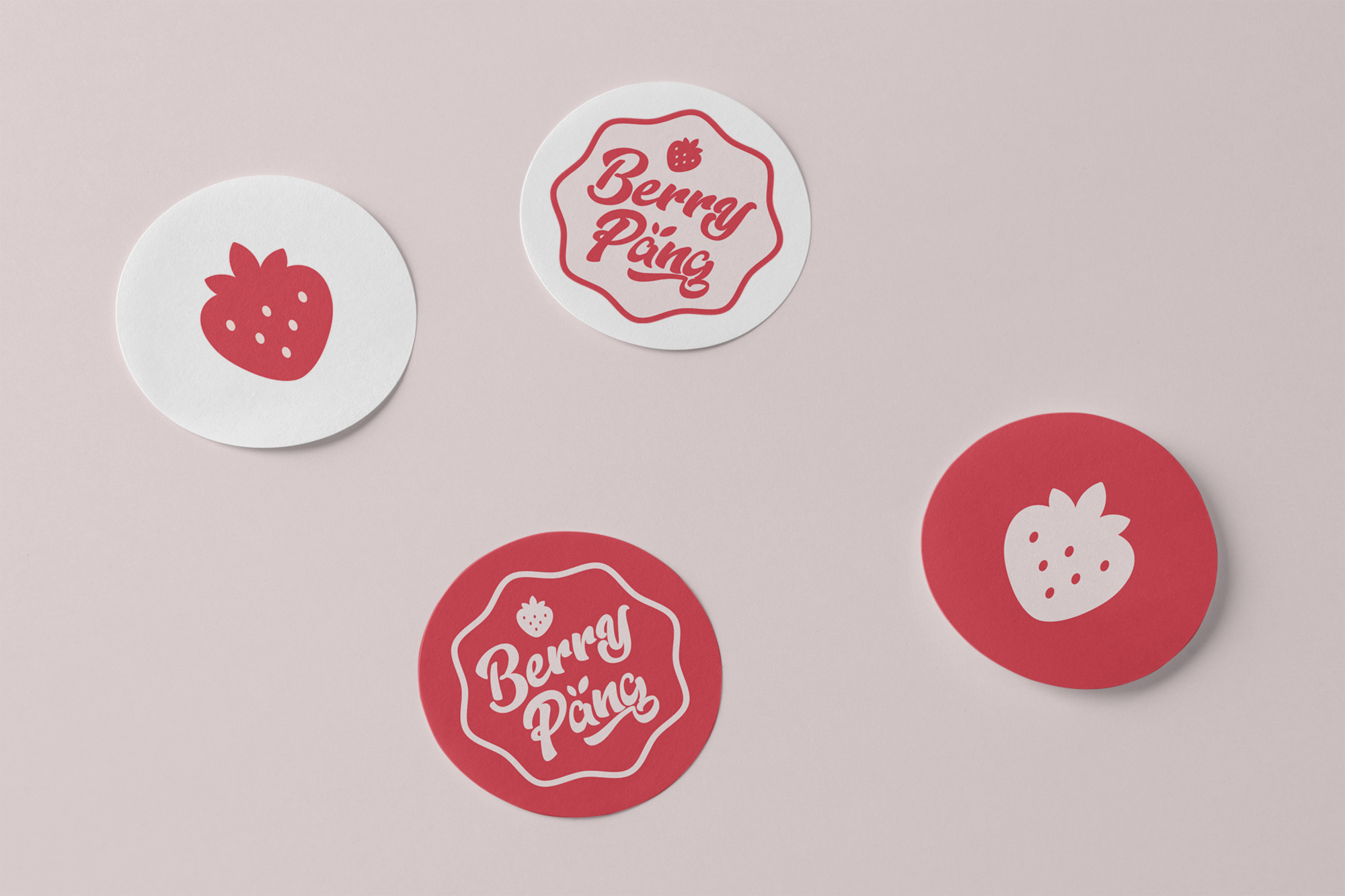
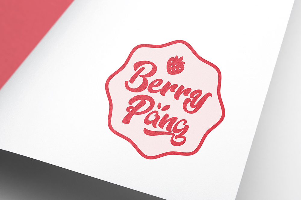
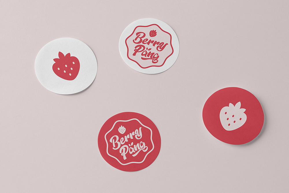
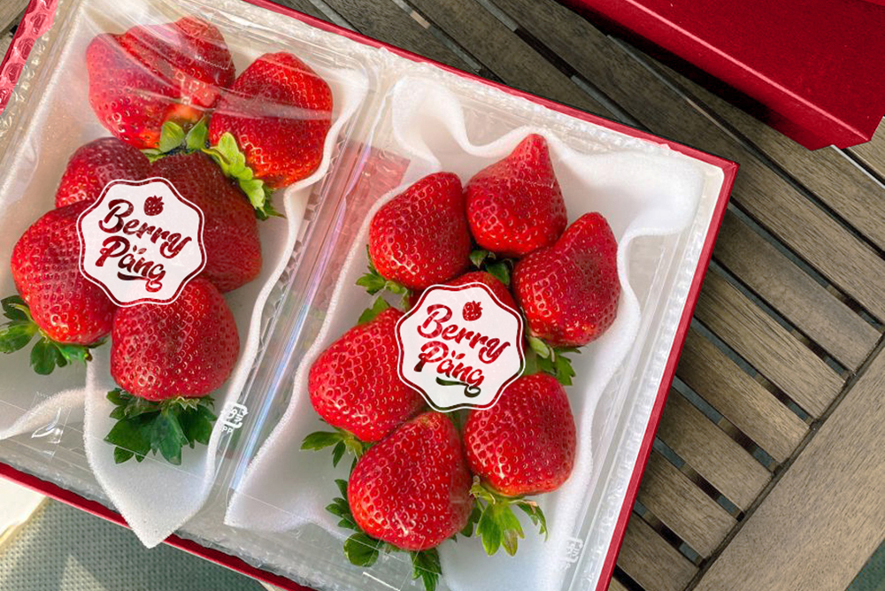
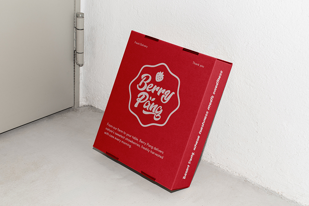
Logo design for Berry Pang, a strawberry brand based in South Korea.
For Berry Pang’s logo design, I created a playful mark that captures the brand’s fresh strawberry essence through a vibrant, approachable visual language. Inspired by iconic candy branding like Chupa Chups, the logo uses a certification-style emblem that communicates trustworthiness while maintaining a youthful, energetic feel. Soft strawberry-inspired colors and rounded typography ensure the design feels instantly friendly and accessible to all ages.
The design system emphasizes immediate recognition through a clear strawberry-related visual language, balancing professional credibility with a charming, trendy aesthetic. Each element – from the color palette to the logo’s shape – works to convey Berry Pang’s core promise of fresh, joyful strawberry distribution. This approach helps the brand stand out in the produce market by speaking directly to its target audience with a distinctive, approachable visual identity.
Credits
Designer : Eva Park
Illustration : Freepik
© 2024 Hyojeong Park
